Much as I love travelling by train, experience has taught me that UK rail journeys can be fraught with difficulty.
I’ve documented some of my concerns before, like ridiculous ticket options and mobile email woes.
But on Friday, I found it near-impossible to book a ticket at all. Let me explain…
The First Great Western backstory
The train company operating services from London Paddington to Bristol, Bath and the west of England was, until recently, called First Great Western.
First Great Western was such a hit that, at the height of its notoriety, it spawned several critical websites and was even subjected to a strike by its passengers.
The First Great Western moniker was retired earlier this year and the company renamed itself Great Western Railway. Given the brand’s chequered history, this decision probably makes sense.
The elegant new livery looks fresh and echoes the railway’s history. The company’s website grandly proclaims that it has ‘given the West back its Great Western Railway’.
When buying a ticket is a challenge
So far, so pretty. But the road to poor customer experiences is paved with good intentions.
Today I wanted to book a simple journey: a day return from London to Bristol. Should be easy, right?
Wrong.
First, I tried the new GWR website. Repeated attempts to book saw me stymied by an unhelpful, generic error message:

Errors are always frustrating. They obstruct your progress and prevent you achieving your goals. But errors like this are particularly irritating because they don’t explain what’s happened, nor make any attempt to apologise.
A simple ‘sorry’ — no matter how automated and insincere — is better than none at all.
What’s more, when presented with vague errors, many people blame themselves — even when the problem really isn’t with them.
Irritated by this error and somewhat lacking in patience, I turned to the company’s iPhone app. This proclaims it can store mobile tickets, so I was briefly excited at the prospect of being able to travel without a paper ticket.
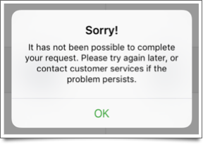
My enthusiasm took a hit when my attempts to view ticket prices resulted in another supremely unhelpful message:

On the plus side, this one at least says sorry. But, again, it doesn’t tell me the cause of the error. Nor does it provide any contact details for customer services.
After seeing this 3 times, I’d had it. So I visited another train ticketing website and booked my tickets there instead.
Fresh new start, same old story?
For GWR this whole experience feels like a missed opportunity. It was my first real interaction with the company since the rebrand, and a good opportunity to impress me.
Instead, I left wondering if anything has really changed underneath the pretty new livery.
Come on, GWR. Give some thought to your customer experience, as well as to what colour you paint your trains.
Depending which statistics you trust, anything from 40% to 65% of emails get opened on mobile devices. Laptop and desktop computers are taking a back seat when it comes to receiving email.
This huge shift to mobile means that if you send marketing emails, you can be certain that a significant proportion of them will be viewed on smart phones and tablets.
If your emails don’t display correctly on these devices, you’ll fail to reach a whole chunk of recipients. In the process, you might even annoy them with a message that doesn’t work properly.
East Coast — only for computers?
With that in mind, earlier today I received an email from East Coast, one of the UK’s main train companies.
Promoting an end of summer sale, it talks up some attractive fares, before leaving smart phone and tablet users out in the cold:

Apparently, ‘mobiles and tablets can’t handle savings like this’. I’d say it’s more likely East Coast’s booking engine can’t handle mobile devices.
Right message, right audience
This feels like a big miss, because the email itself is decent.
The headline deal, ‘train seats from £10’, is compelling. It’s been sent to members of the company’s loyalty programme, who are likely to be regular travellers and familiar with the brand.
In short, the offer is relevant and well targeted.
But that key call to action — the whole purpose of the email — just doesn’t work on mobile devices.
That means anything up to 65% of the people who received it won’t have been able to easily check prices and book a ticket on the spot. Not even if they really wanted to.
What a waste of effort.
Now, I’m no expert in running trains, but you might have gathered from previous posts that I’ve had the odd run-in with train company web design, signs and labelling.
In general, it’s fair to say I’m not a fan. And now I’ve found another piece of nasty sticking-plaster copy lurking on the First Great Western website:

It seems the train company recently made its user password system case sensitive. In terms of security, this is a good move. But to accommodate the change, First Great Western decided to make everyone’s passwords all-uppercase.
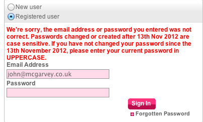
If you don’t realise this when you try and sign in, you see this contrived error message:
We’re sorry, the email address or password you entered was not correct. Passwords changed or created after 13th Nov 2012 are case sensitive. If you have not changed your password since the 13th November 2012, please enter your current password in UPPERCASE.
The red text means it look like a serious error message, and it makes the user think they’ve done something wrong.
This is a classic example of a company making a well-intentioned technical change to its website, but forcing users to adapt to this change, rather than taking some extra steps to make life easier for them.
I call it ‘sticking plaster copy’ because it uses lengthy instructional copy to try and patch up the issue rather than fixing it properly.
Essentially, First Great Western has changed my password without asking. That’s inelegant and impolite. (It also raises the question of how securely user passwords are stored, but I’ll leave that issue to the technical experts.)
It makes my interaction with the website more awkward, adding an extra barrier that I have to overcome in order to buy a train ticket.
As an alternative, they could simply have allowed me to sign in as normal, then prompted me to change my password at a later point – perhaps immediately after signing in, or once I’d completed my purchase.
That would have made my life a bit easier, and it might even have positive impact on their website’s conversion rate too.


