Why more choice isn’t always a good thing
I’m a bit of a fan of Bristol-based Chemical, a self-proclaimed ‘music lifestyle store’ offering music, clothing, CDs, vinyl and more to its customers.
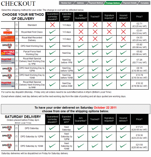
However, I’m not convinced the fashion-and-more retailer has quite got its online checkout process licked. Just have a look at this bemusing range of delivery options:
(See this image full-size in a new window.)
It reminds me slightly of the Trainline’s bonkers ticket selection screen, which I wrote about way back in 2007. In any case, the options presented are confusing and unnecessary, particularly if you want to get your order in a hurry.
With six next-day delivery options to choose from, how do you tell which is best? This comparison chart is less-than-helpful, because each of the options has exactly the same columns ticked.
Rule number one of creating an online checkout process is to keep it as simple as possible. Adding complexity makes it harder for people to complete their order, meaning fewer people manage to get to the end of the process.
Sure, it’s good to offer some choice of delivery options, but too much choice creates uncertainty: how do you know which is the best option for you?
I think Chemical would do well to chop their bemusing range of delivery services down to three: standard, guaranteed next-day and guaranteed Saturday. If they did, I bet they’d see a decrease in the number of visitors dropping out before completing their online orders.

