Depending which statistics you trust, anything from 40% to 65% of emails get opened on mobile devices. Laptop and desktop computers are taking a back seat when it comes to receiving email.
This huge shift to mobile means that if you send marketing emails, you can be certain that a significant proportion of them will be viewed on smart phones and tablets.
If your emails don’t display correctly on these devices, you’ll fail to reach a whole chunk of recipients. In the process, you might even annoy them with a message that doesn’t work properly.
East Coast — only for computers?
With that in mind, earlier today I received an email from East Coast, one of the UK’s main train companies.
Promoting an end of summer sale, it talks up some attractive fares, before leaving smart phone and tablet users out in the cold:

Apparently, ‘mobiles and tablets can’t handle savings like this’. I’d say it’s more likely East Coast’s booking engine can’t handle mobile devices.
Right message, right audience
This feels like a big miss, because the email itself is decent.
The headline deal, ‘train seats from £10’, is compelling. It’s been sent to members of the company’s loyalty programme, who are likely to be regular travellers and familiar with the brand.
In short, the offer is relevant and well targeted.
But that key call to action — the whole purpose of the email — just doesn’t work on mobile devices.
That means anything up to 65% of the people who received it won’t have been able to easily check prices and book a ticket on the spot. Not even if they really wanted to.
What a waste of effort.
They’ve tried filling email subject lines with CAPITAL LETTERS and personalising them with your name. Now I’ve noticed a new tactic from email marketers looking to boost the open rates of their email campaigns.
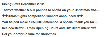
It’s to make their messages stand out in your crowded inbox by including special characters like stars, hearts and smiley faces in subject lines. And at first glance, it works.
I bet you notice the special characters here:

I’ve seen emails that use symbols representing the sun, an umbrella, a plane and more. There are lots of different symbols you can try and as statistics show they can help increase open rates, you can bet we’ll be seeing a lot more of them in the coming months.
But I’m not sure it’s a good idea to start using them willy-nilly in marketing emails. Here’s why:
- Like using ALL CAPITALS TO SHOUT or grabbing attention with horrific blinking text, special characters seem a little impolite. They don’t show the reader much respect. They attract eyeballs but don’t add extra information in themselves.
- It can be hard to get special characters to display properly across the wide range of software and services people use to receive email, adding extra complexity to your mailings. Broken emails just make you look silly.
- The phenomenon of banner blindness means people don’t pay attention to things that look like adverts online. As special characters become more widespread, users may start to ignore them in the same way.
Besides all that, there’s the question of taste. Special characters can look a bit, well, cheap. Like trying to entice customers into a run-down shop by playing music outside, or hassling people in the street to try your restaurant, you need to think about the image you project.
Do you want to be part of the crowd that screams ever louder for attention, or would you rather invest your time in more subtle, nuanced ways of attracting and keeping customers?


