This is no way to run an airport
The user-friendliness of air travel has been documented before. The confusing nature of boarding passes is just one example of how the world’s airlines could make things a little easier for travellers.
Catching a flight from London City Airport this morning, I spotted another gem.
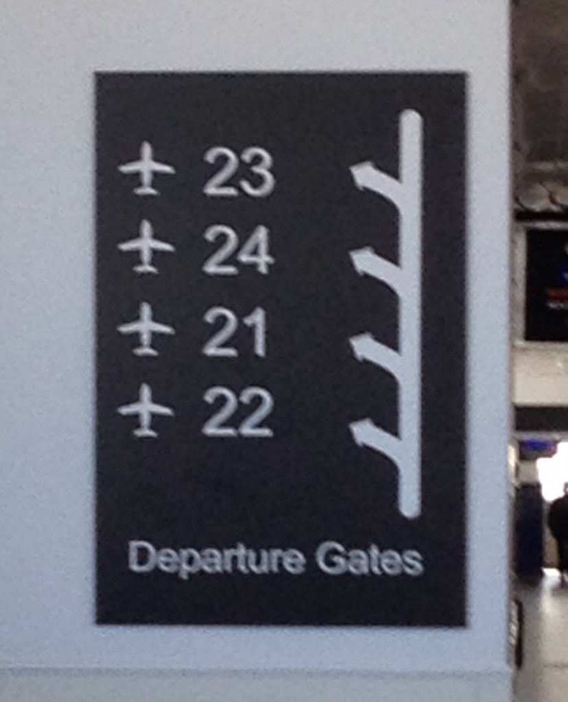
If your flight is leaving from gate 21, 22, 23 or 24 at London City, you need to pay special attention to where you’re walking. Because this is how those gates are numbered:

Yes. 22, 21, 24, 23. At City Airport, numbers run in a different order.
This isn’t just another dig at how airports work. It’s a great example of how small details can make the difference between an average experience and a good one.
If you need a sign to explain the order in which thing are numbered, you’re doing it wrong. That sign is equivalent to the sticking plaster copy that clogs up websites because things aren’t sufficiently intuitive.
Or to put it another way: you couldn’t be bothered doing it properly, because it was easier to just explain why it doesn’t work the way people expect.
And yes, these details really matter. Imagine you’re running late for a flight. Your gate — gate 24 — is about to close. Sprinting through departures, you catch a glimpse of a sign: ‘Gates 21 – 24 this way.’
‘Great,’ you think. ‘It’s just typical that my gate would be furthest away.’
As your feet pound the floor, you know it’s going to be tight. Turning a corner, you can see a gate at the end of the corridor.
The sign comes into focus as you approach. It says ’23’. You’ve run right past the gate you needed. And you’ve missed your flight.
I’ve written before about how breaking with convention is a dangerous game. If you’re going to mess with the most fundamental of all conventions — like the order of numbers — you can expect to irritate your users.
