What The Economist can teach us about great writing

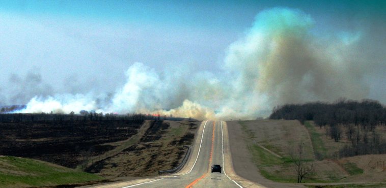
In The Economist, nothing ever spreads like wildfire
It’s often said that good writers should read often and read widely. One source of consistently strong writing is The Economist.
Although you can find superb prose on its website, the magazine is well worth its £5 cover price.
At face value, you might expect it to be a dry, sober read. But The Economist brings complex subjects to life through writing that’s exceptionally clear and instantly engaging. Here are a couple of examples.
Using unnecessary words
Published recently, this moving piece examines how Northern Ireland is dealing with crimes committed during the troubles.
It includes an interview with June McMullen, whose husband was shot in 1981.
The first quote in the piece ends with three words that hint at the human cost of political wrangling and help the reader paint a picture of the interview in their mind (the emphasis is mine):
‘“I knew he couldn’t have survived it,” she recalls, over tea in her spotless kitchen. “Johnny was pronounced dead at the scene, so he was.”’
That ‘so he was’ is a typically Northern Irish turn of phrase. Including it in the piece seems to contradict a key rule of The Economist Style Guide (‘if it is possible to cut out a word, always cut it out’). Yet it adds detail and introduces some emotion, drawing you into the piece and enticing you to read further.
Knowing when to break the rules is, it seems, an important part of crafting articles fit for The Economist.
Putting a new twist on an old cliché
In the same edition, there’s a fascinating article about how new crop strains could help pull millions of people out of poverty.
The style guide’s first rule is ‘never use a metaphor, simile or other figure of speech which you are used to seeing in print.’ The opening paragraph of this piece is notable for following it:
‘Borlaug’s varieties put out more, heavier seeds instead. They caught on like smartphones.’
In The Economist, good ideas don’t spread like wildfire, sell like hotcakes or grow like weeds.
They do something more original, because clichés should be avoided like the plague. Ahem.
For more writing inspiration, check out The Economist Style Guide and website.
Image: Flickr user woodleywonderworks under a Creative Commons licence.


 Remember