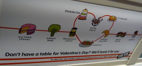
Directory enquiries service 118118.com has traditionally relied on hairy athletes, a reworking of the theme tune from Rocky and promotional stunts involving handing out “118” jogging vests for advertising.
However, this market is a crowded one, so maybe it’s no surprise that as well as broadening its services to include restaurant reservations and cinema listings, 118118.com has started to try a new tack with its advertising.
I spotted the advert pictured above on the tube the other day. It made me chuckle when I saw it, and I think it works well for three reasons:
- It fits the location. I saw this particular advert on the Bakerloo Line and it features a reimagined tube map. That’s clearly not a coincidence.
- It’s bang on for an audience of Londoners. Seeing the renamed station Piccalilli Circus will surely raise a smile, even on the humourless tube.
- It keeps the elements of whimsy and fun that are so crucial to the brand. Ever since those joggers, 118118 has tried to have fun.
As an effort to wrestle market share away from the other 118-alikes, I think this is a good attempt. Have any adverts caught your eye lately?
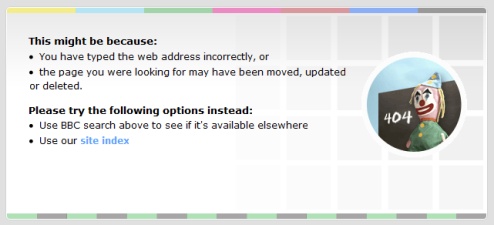
We’ve all done it: followed a link from a website, only to be met with those three words of dread: page not found. How frustrating – particularly if you clicked a really juicy-sounding link to get there.
When you get misdirected in this way, it’s doubly annoying if you hit a total dead end. No links, no search box and no navigation? All you can do is give up and retrace your steps by clicking back.
Kudos, then, to websites which turn the humble page not found message into something useful and entertaining.
Take the BBC’s effort. With a friendly message explaining what happened, a link to the main site navigation and a search box there are plenty of places to go next. Good.
They’ve really upped the ante with the visuals though, alluding to the BBC’s long history by adapting the old fashioned test card for the web.
This means a lot to those of us over a certain age. It takes us back to the days when TV used to close down overnight, so if you got up early enough there’d be nothing to watch except this slightly strange picture of a girl and a clown.
It plays on our nostalgia and makes us smile unexpectedly, turning a bad experience (not arriving at the page we expected) into a reasonably good one.
Have you spotted any other good error pages online? I’m thinking of compiling a list, so please leave a comment if so.
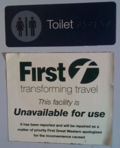 I spotted this notice getting off the train the other day.
The First Great Western tagline seems to be “transforming travel”. And perhaps they are.
But sticking it on what amounts to an out of order sign for the toilet doesn’t seem to project the intended impression of their brand.
Transforming travel? What, one broken loo at a time?
Big companies love their taglines. It’s a shame they don’t always use a bit of commonsense when deciding where they should be displayed.


 I spotted this notice getting off the train the other day.