 If anyone’s landed a difficult marketing job, it’s got to be whoever’s in charge of encouraging people to use Slough’s buses more. Buses aren’t sexy at the best of times – put one in Slough and you have a real challenge.
This copy on the back of a spanking new bus there caught my eye. The “warp drive (OK, not warp drive)” line’s a refreshing bit of honesty, but then they went and spoilt it all by claiming it’s “a cool way to go to work”.
Copywriting rule #1: if you have to point out the fact that something’s cool, it very definitely isn’t.
Still, eight out of ten for effort. Like I said, it’s a tough job.
 The number 17’s one of the major bus routes in Reading, and actually the service isn’t usually too bad. The way the timetables are presented is pretty good as well: instead of posting the full timetable everywhere, each bus stop has an individual printout listing only the times buses arrive there.
Makes sense really; showing just the relevant information makes it easier to find what you’re looking for.
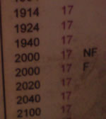
But there’s still room for improvement. I noticed this at a bus stop this evening. Two buses are listed at 2000 hours. One has NF by it, one F.
No, it’s not a reference to the National Front. The NF stands for “not Fridays”. The F means “Fridays only”. The difference between the two? There isn’t one. They leave at the same time and run to the same destination, with the same interim stops.
Extra lines, extra numbers – and there’s no reason for them. It just creates uncertainty and confusion. Sure, it’s a minor thing, but I bet it’s confused someone, at some point. And it would be easy to rectify. So why haven’t they?
It’s the same with websites. Is everything there for a reason? Because if it’s not, it’s just noise.
I spent some of today heading south from Crewe on a Virgin train. Their trains are pretty new, and seat reservations aren’t indicated by a bit of paper on the seat. Instead, there’s a little screen on the luggage rack that says whether the seat’s free (‘This seat is not reserved’) or taken.
If it’s taken then it says the stations the seat has been reserved between. This is handy – if the display says ‘Birmingham to Reading’ but you’re already well out of Birmingham, it’s safe to assume that the person meant to be in the seat hasn’t turned up, so you can take it yourself.
The benefits to the train company are obvious; there’ s no need to send staff through the train to put the right reservation cards on the right seats. One button and (presumably) it’s done.
Unfortunately it was all a bit too confusing for one of my fellow passengers today. At first he didn’t spot the screen. And then when he did, he assumed the seat was free because nowhere did it use the word ‘reserved’.
It was a busy train, and I’m honestly not sure if he was telling the truth or just pleading ignorance in the hope he’d be allowed to keep the seat. But either way, Virgin could make things clearer. It got me wondering whether a copywriter had written the text, or if they’d just gone with whatever the person who wrote the software put there.
A couple of small changes is all they’d need. They could add ‘Reserved from…’ to the copy on each screen. And some well-placed notices explaining how reserved seats are indicated would make it crystal clear. The displays aren’t that obvious, unless you’re particularly tall or know where to look.
Little changes like this can make a big difference when you’re trying to get a message across. The principle applies to websites as well – and one of the great things about working online is that it’s usually easy to make the edits.
 If anyone’s landed a difficult marketing job, it’s got to be whoever’s in charge of encouraging people to use Slough’s buses more. Buses aren’t sexy at the best of times – put one in Slough and you have a real challenge.
 The number 17’s one of the major bus routes in Reading, and actually the service isn’t usually too bad. The way the timetables are presented is pretty good as well: instead of posting the full timetable everywhere, each bus stop has an individual printout listing only the times buses arrive there.