Don’t they say it’s the little things that count? Well, nothing makes me smile more than spotting some text that someone’s really taken time and care over – despite it being displayed in a seemingly unimportant or innocuous location (ok, actually some things do make me smile more, but bear with me here).
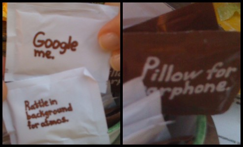
Take these sugar packets I spotted at a cafe in Oxford. Ropey pictures aside, aren’t they delightful?
It’s hard to argue that text on the back of a sachet constitutes a vital part of a company’s branding. And yet it’s equally hard to deny the effect it has: when customers notice their sugar packet says “rattle in background for atmos” on the back, it helps set that particular cafe apart from the countless others that line Oxford’s touristy streets.
The lesson here? Small things matter too. A piece of well-placed text can make your brand stand out in people’s minds. I know where I’ll head for lunch next time I’m in Oxford.
I’ve been booking a holiday recently and searching lots of sites for deals and discounts. Lonely Planet‘s hotel booking service seems to need a bit of work – it broke more than once while I was using it.
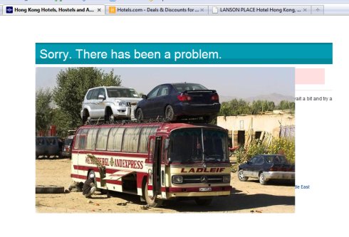
Still, at least when it fell over, it didn’t display a dull generic error message:
 Check it out! It’s a picture of a knackered bus – the type you might get in some the far-flung parts of the world that Lonely Planet can help you visit. (Full size here.)
Ok, never mind that in reality you’re probably just looking for a cheap week in Benidorm. This error page is a great example of how a bit of quirkiness can turn a negative (my hotel search not working) into a bit of a positive (making me chuckle).
It certainly put a bit of a smile on my face, and I’m more likely to give the site another chance as a result.
What could your site do differently to surprise its users?
 Subway. Love ’em or hate ’em, you can’t get away from them. Really, you can’t. A quick check reveals eight branches in my home town of Reading alone.
That’s more than one town needs. In fact, it’s probably more than the entire south east of England needs.
Still, while you might not be a fan of their ubiquitous food (or the nasty smell they pump out) they must be doing something right.
This is one franchise that’s expanded like mad over the last couple of year and if there’s a built-up area in Britain without a Subway, well, I doubt it’ll be lacking one for very much longer.
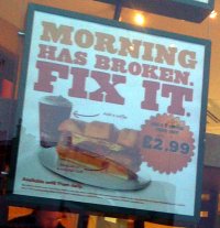
Their marketing isn’t too shabby either. I walk past two(!) most days, and for the last couple of weeks they’ve had a nice bit of copy on a poster in the window. You can probably make it out from my poor photo, but just in case, here’s what it says:
“Morning has broken. Fix it.”
Why do I like this? It’s a reasonable pun. It’s short and snappy and it sticks in your mind. And it’s totally relevant to the product they’re advertising: breakfast.
In fact, I reckon it’s the best poster copy I’ve seen in quite some time. So say what you like about their food, but they’ve obviously got someone in who can put together a decent line for a poster. I’d give them 2/10 for the sandwiches, but 8/10 for the copy. Good work.
