Great products and services should delight you the first time you use them. No matter what you’re doing — unboxing your new smart phone, say, or signing up for a Tumblr account — it should be memorable.
That first experience has to be good, because it sets the tone for your ongoing enjoyment of whatever it is you’ve just started using. If it’s bad, you might never use that product or service again.
But if there’s one thing I love more than a great first-use experience, it’s when a product surprises me long after becoming part of my life.
Take my iPhone. My constant companion for three years, I’ve used it for thousands of calls, text messages, emails and tweets.
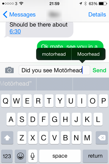
I thought I knew everything there is to know about that handset. But yesterday, I was tapping out a text message about the recently-revealed Glastonbury line-up.
The bands announced include Motörhead, a bunch of British rockers who added an umlaut to their name ‘to look mean’.
As I spelt out their name on my iPhone, the autocorrect function added the umlaut automatically.
I would never expect my smart phone to know how to spell ‘Motörhead’. So when it changed my spelling (I have no idea where to find an umlaut on Apple’s keyboard), the attention to detail made me smile.

It was unexpected. It stopped me in my tracks for a moment, while I realised what it had done. And it made me chuckle.
I don’t think there are many gadgets that would keep surprising me, even after three years. That’s a sign that real care and attention has been put into the user experience.
I’ve said before that I believe copywriters and content creators do their best work when they collaborate closely with designers.
Quite simply, design and content are interdependent. You only get the best final product when you consider them together.
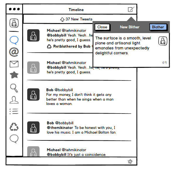
One tool that makes this easier is Balsamiq. It’s a straightforward-yet-powerful piece of software that lets you create rough layouts and low-fidelity wireframes very quickly. Here’s an example:

You can choose from a wide range of design elements, drop them onto your page and arrange as necessary. It’s impressively fast and easy to get the hang of.
Bridging the design gap
Because Balsamiq is so speedy, it can help bridge the gap between writers and designers without introducing unacceptable overheads.
I use it in three main ways:
1. To indicate the relative prominence of content
When I’m working on a content plan, sketching web pages in Balsamiq is a good way to show what content elements should feature and how important they are.
If the final content plan explains the ins and outs of each page, the accompanying Balsamiq mockups provide a quick, visual guide to what content should exist and how visible it should be.
2. To put content in the design early
If I’ve agreed the rough layout of a page with a designer, I’ll knock it together in Balsamiq and drop in my draft content.
This provides context, giving an early indication of whether the content fits the proposed layout. Sometimes, it validates your approach. At other times, it can spark a rethink. Either way, it’s really useful.
3. To save the designer a bit of work
Many designers use Balsamiq to develop web page prototypes at the start of projects.
If so, I can take the prototype and add draft content, providing an altogether more representative view of each design approach without requiring the designer to copy and paste text.
Why unpolished is better
However you use Balsamiq, the resulting mockups look intentionally unpolished. And that means they’re a brilliant way to gather initial feedback without clients thinking ‘this is exactly how it’ll look when it’s finished’.
I’m no designer. But Balsamiq puts basic design tools within my grasp, providing an effective platform to communicate and collaborate with designers.
I purchased it about a year ago so I could work with one client on one particular project. Now, I’d say I use it about every other day. It really is that useful.
Balsamiq is available as an online app ($12+ a month) and as a desktop app for Mac (from $79).

For the last year or so, I’ve been using an online writing tool called Editorially.
When it launched in early 2013, Editorially promised a new way for writers to work and collaborate with editors, contributors and — in my case — clients.
Simple and fast
Compared to bloated tools like Microsoft Word, Editorially is stripped back and super speedy, with an uncluttered appearance that encourages you to focus on what you’re writing.
Unlike Word, it doesn’t impose print standards like A4 on your work. That means Editorially makes a lot of sense for digital writing where the idea of a physical, printed page is irrelevant.
Better collaboration
But for me, the real power of Editorially comes from two things:
- It relies on markdown to format text. Once you learn a few shortcuts (like # for a main headline or stars *for italics*), you can add formatting without needing a full WYSIWYG editor. It exports clean HTML and can publish straight to WordPress, too.
- It offers well thought out collaboration functions. These make it pretty easy to send work out for review and gather comments, without relinquishing control altogether or ending up in a painful writing-by-committee-using-tracked-changes situation.
It took a while, but Editorially has become a valuable weapon in my writer’s armoury.
So, it’s a real shame that it’s shutting down.
The end of Editorially
The company announced the end of its short-lived service last week, in an articulate and honest blog post.
“Editorially has failed to attract enough users to be sustainable, and we cannot honestly say we have reason to expect that to change.”
In some ways, this is a stark illustration of the economics of online tools. Editorially has no sponsorship and charges no fees to its users (although it had planned to introduce charges and I would have happily paid).
It seems to have followed a fairly typical digital business model: attract lots of users, and work out how to make money from them later.
But it sounds as though disappointing user numbers have eliminated any hope of Editorially becoming a sustainable business. I wonder if that’s because Editorially is a good idea that the world isn’t ready for.
We all default to Microsoft Word
The big challenge Editorially faces is that we’re all pretty much hard-wired in to using Microsoft Word. When you need to write something, you reach for the big ‘W’ on your desktop.
It’s hard to break away from this pattern. And believe me, I’ve tried.
Although I’ve been using Editorially a lot to work up ideas and write draft content, often I end up exporting it to Microsoft Word in order to share it with clients.
It’s just easier that way. Although it’s not the best tool for the job, people are comfortable with Microsoft Word. If I send them a .docx file, they can just open it.
But if I send them a link to Editorially, they have to enter their details to register, then figure out the best way to view my content and add comments.
It’s hardly an enormous barrier, but it’s big enough.
What now for Editorially users?
Editorially is one of the quickest and tidiest ways I’ve found to work on digital content. It’s the first purpose-built tool for content creation that I’ve tried and stuck with.
But now I have to find something else.
I’ve dabbled with IAWriter and Scrivener. I’ve heard good things about Penflip. I’m sure I’ll keep using Microsoft Word out of necessity, but there’s definitely an Editorially-sized gap in my professional life that needs filling.
Image from Alan Turkus on Flickr under Creative Commons.


