If you’re looking for a decent, free image editing tool, but don’t need the expense of Photoshop or the complexity of GIMP, I can highly recommend Paint.NET.
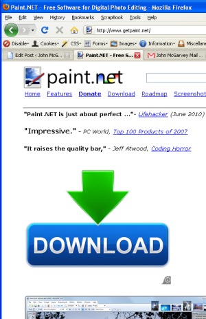
However, if you plan on downloading this free software, stay sharp when you’re on the Paint.NET website. Because the link to download isn’t quite as obvious as it seems:

That big ‘DOWNLOAD’ button with the huge green arrow that drags your eyes in and won’t let go? That’s not it.
It is, in fact, an advert. It takes you to www.searchale.com, a site offering ‘the ultimate search tool’ – as far as I can tell, a toolbar you can download and use in your web browser.
I can’t find much other information about the company, apart from this complaint from someone who had the ad appear unexpectedly on their own website. So my advice would be to steer clear.
Oh, the actual download link? It’s up the top there, just beneath the logo:

It’s not hard to see how SearchAle benefits from this advertising. I’m sure there are more people using its toolbar then there would have been otherwise.
I just wonder how many of those people actually wanted it, or even understood what they were downloading.
 Flicking through the careers page of The Guardian last weekend, I stumbled across an ad for a job with a company called Evitavonni.
“Hmmm,” I thought, “I’ve not heard of them before.” The name made me think that perhaps they were Italian, or maybe founded by someone called Evita. The look of the ad suggested some kind of design company.
Read it backwards
However, after studying the name a bit more, it hit me. Have you spotted it yet? The company is “innovative”, spelt backwards. Evitavonni. Innovative.
I’d love to know what process the company went through before coming up with that particular name. Because I’m struggling to see how backwards innovation can be a good thing.
A new trend in naming?
To me, writing a word backwards implies the opposite meaning. So by that token, Evitavonni suggests a business that’s old-fashioned, change-resistant and set it its ways. Doesn’t it?
Thing is, I don’t think they are. You certainly wouldn’t expect an uninnovative company to sell striking products like this expensive outdoor fireplace.
So, what gives? Why pick that particular name? Is backwards spelling a new trend in branding that’s yet to take off? (I can’t think of a single other company named in a similar way, though I’m happy to be corrected.)
Honestly, I’m stumped. But I do think if you’re going to pick a word and spell it backwards, you should at least choose one which will create a positive impression of your company.
Update: Since posting this, I’ve discovered there’s a good list of backwards brand names over at Fritinancy. I found it most interesting to learn that Trebor is the reverse of the company’s founder’s first name. Seems it’s not as uncommon as I thought.
It’s never been easier to find photos for your website. Pile-’em-high-sell-’em-cheap stock photography companies like iStockPhoto, Shutterstock and Fotolia allow you to purchase photos for as little as a pound or two.
These sites have drastically cut the cost of getting hold of images without worrying about copyright issues. I use them, so I should know. But there’s one big problem: when you pay so little, you don’t get any control over who else uses the photos.
Those images are sold again and again and again. Some of them are exceptionally popular – and that can spell embarrassment for your website.
I’ve trawled iStockPhoto – one of the biggest stock imagery sites – to bring you these five examples of stock photography that’s been rather, well, overexposed. If you’re looking for images to illustrate your website, steer well clear of these.
From web hosting to chief marketing officer

Plenty of websites seem to like the look of this lady. When she’s not urging you to “get more now” over at Midphase Hosting, she’s also putting in an appearance at Data102, a Colorado Springs hosting centre.
Then there’s marketing. She’s been standing in as a chief marketing officer for Brand Week – and been involved in this article about self branding. Busy lady.
A tired metaphor for growth

If you’re growing a business, here’s one visual metaphor you might want to steer clear of. It’s a very well-trodden path, you see. It might have been Clydesdale Ventures that first used this image. Or maybe it was Ian Brodie. Or Accelerate Media.
In hard copy, the books Recession Thriving and Trading Pain for Peace both have strikingly similar covers. Those green shoots of recovery are certainly spreading. (more…)


 Flicking through the careers page of The Guardian last weekend, I stumbled across an
